User Interface
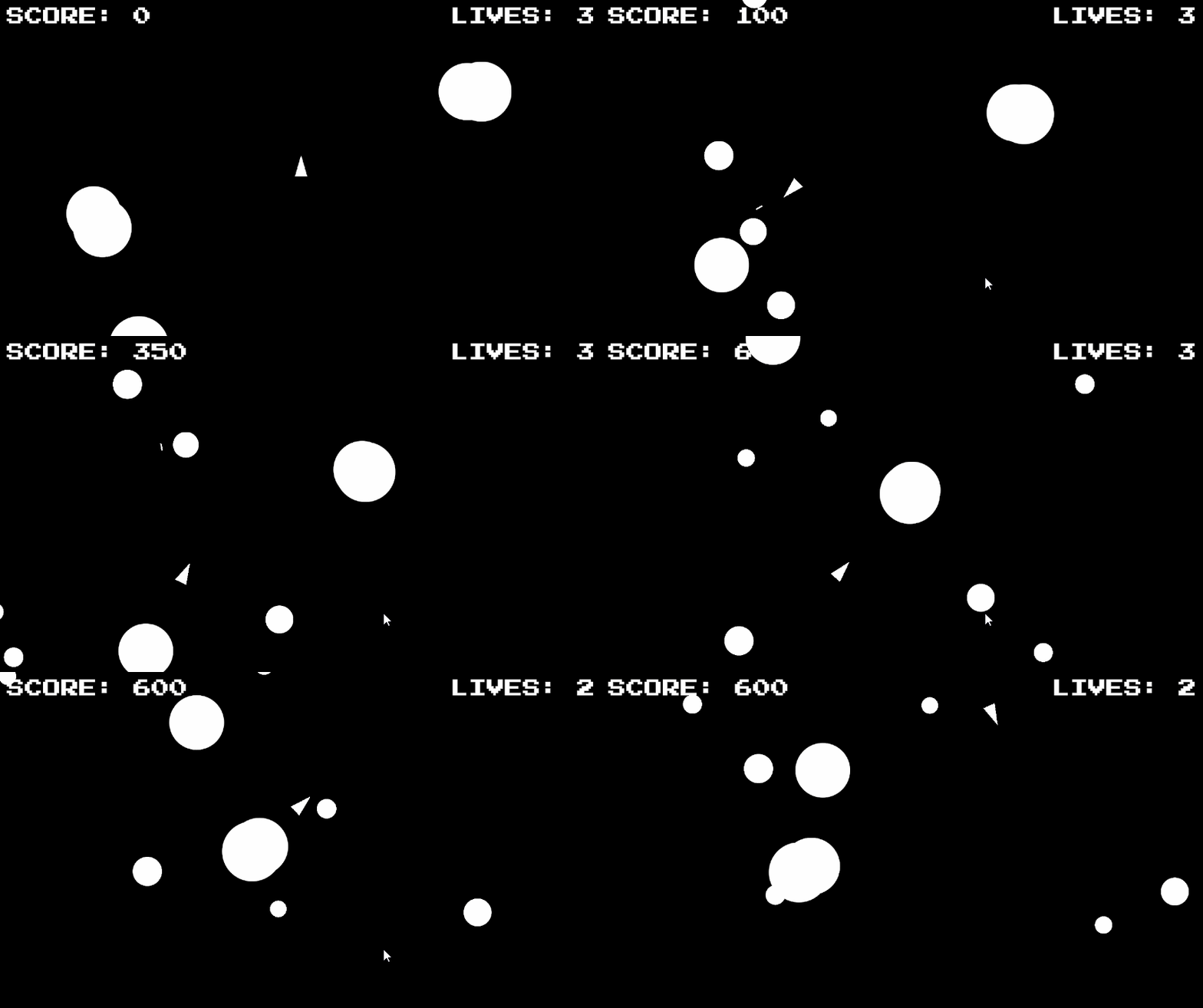
In this tutorial we will learn how to edit and create a user interface within Unity. Additionally, we will learn how to connect our interface to our code to display the player’s score and lives. The end goal of the next set of tutorials is to have a live display for our score and lives in a pixel style font.
UI and Canvas
The user interface within Unity projects is created using a Canvas game object. The Canvas game object is automatically created whenever we create a UI element.
In our project, let’s begin by making a canvas game object.
Navigate to GameObject >UI (Canvas) > Canvas.
Looking at our Canvas game object, we will notice that it contains a Rect Transform and a Canvas, Canvas Scaler, and Graphics Raycaster components. We will cover the Rect Transform component later in this tutorial, so, for now, let’s focus on the specific Canvas and Canvas Scaler components.
Canvas Component
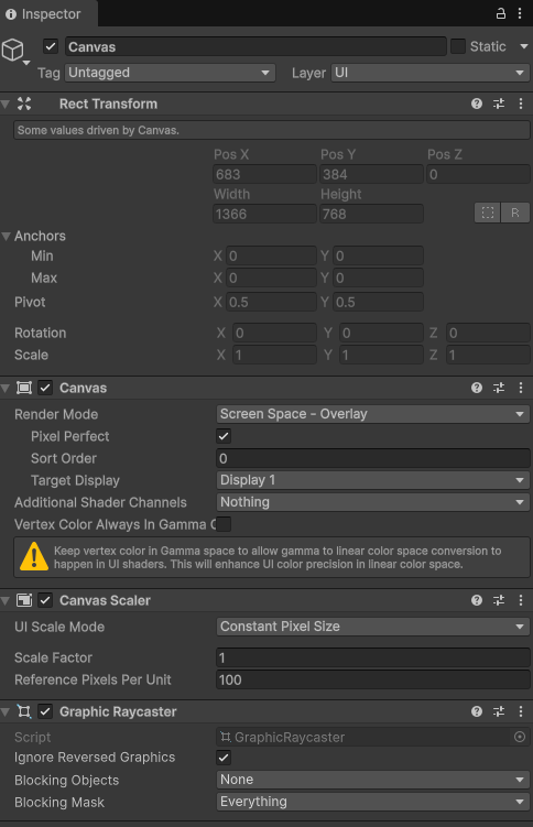
The Canvas component controls how our user interface is drawn to our game screen. We can notice that by default the value of Render Mode is set to Screen Space - Overlay. This mode will draw our canvas over our entire screen. We can see within the drop down we also have an option to have our UI connected in screen space to particular camera, as well as have the ability to draw a user interface within the world space of our game. In this tutorial, we want our user interface to be generically linked to the space of our screen. For this, we can keep our Render Mode property set to Screen Space - Overlay.
Pixel Perfect
Another property we can see is the Boolean check box for Pixel Perfect. Making UI canvas pixel perfect will remove smoothing from UI elements, leading to crisp pixel edges. Using a pixel perfect camera is best when many of your art assets are simple graphics or pixel art. If you are using non-pixel fonts and more complex image art assets, it is best to keep the pixel perfect camera checked off. In our case, since we are creating a simple graphics game and will use pixel fonts, let’s check on the pixel perfect camera.

Canvas Scaler
The last property we should consider changing within our Canvas game object is the UI Scale Mode within the Canvas Scaler component. The UI Scale Mode handles how the UI is scaled on various display sizes. By default, the UI Scale Mode will be set to Constant Pixel Size.

This will keep all elements the same pixel size regardless of the size of the display.
As an example, if we have a text UI element on a 1920 by 1080 pixel display that is around 600 pixels wide, the text will look like this:
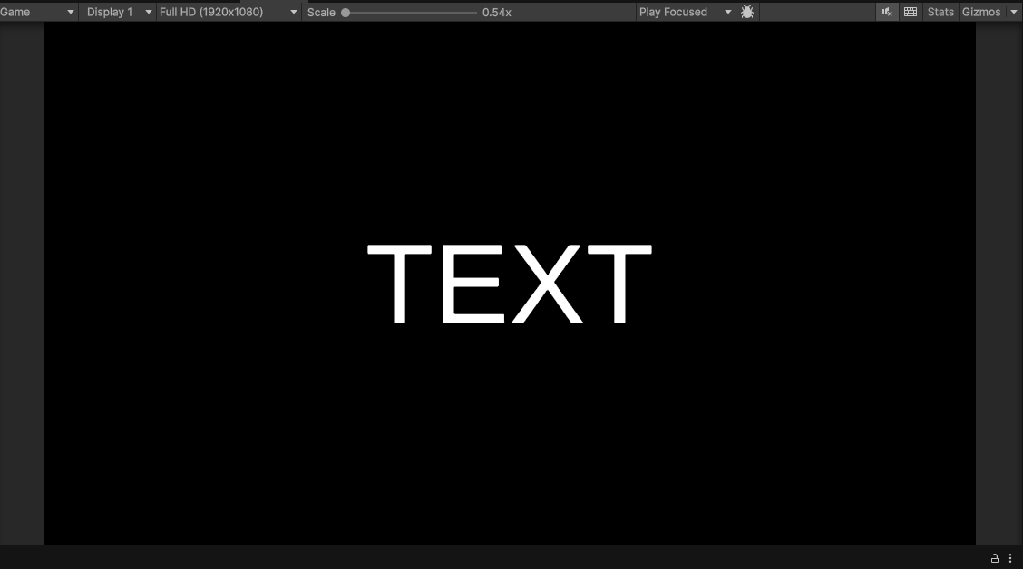
On a 3840 by 2160 4k pixel display, our text will still be 600 pixels wide but will appear smaller due to the higher pixel density of the screen:
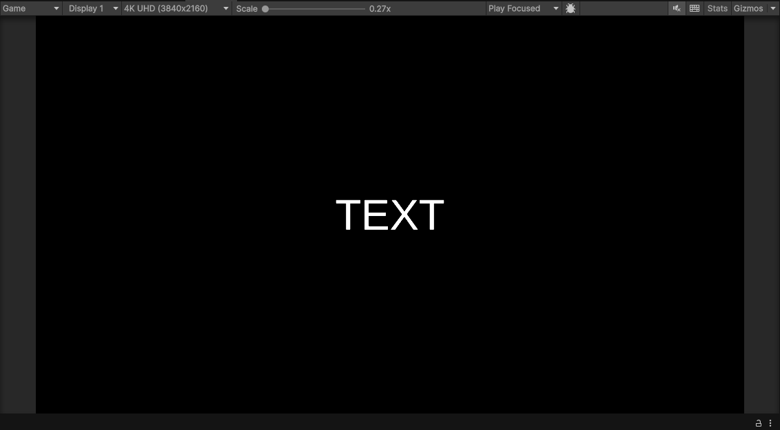
Using Constant Pixel Size for Canvas Scaler component works best if we know our project will be displayed at a constant screen size such as for an installation. However, since our project might be played widely on a variety of screen sizes, it is often best to set your UI Scale Mode to be Scale with Screen Size. This will result in all of your UI elements being scaled relative to the size of your screen. For reference resolution, it is often best to use a standard display size of 1920 by 1080:

As a result, our 600 pixel text element will appear the same size on both a 4k and 1080p display. In the below image note that the resolution of the Game preview is changed:
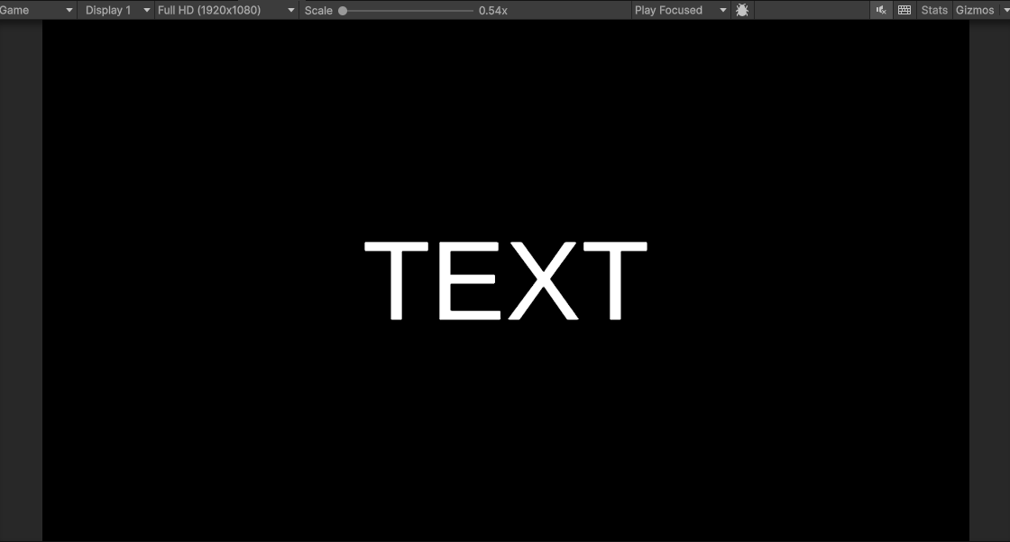
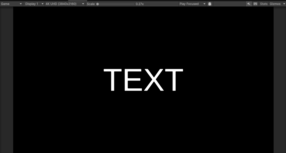
It is often best to change your UI Scale Mode to Scale With Screen Size before creating your UI as changing this value will shift preexisting UI elements. However, typically if your Reference Resolution matches the resolution you made your original UI, your UI should look the same.
Text and Text Mesh Pro
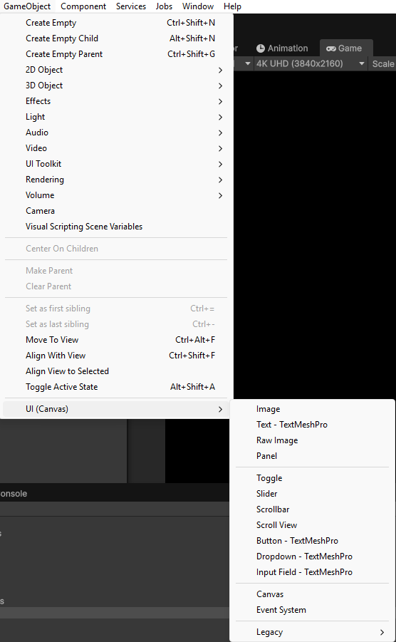
So far in this tutorial, we have been viewing a text game object, yet we have not learned how to create one within our scene. Like all other UI elements, the Text UI element can be found under the UI(Canvas) section of the Game Object menu. From this menu, we can create a variety of elements from scroll bars to images. This tutorial will mainly focus on text and I would recommend exploring the Unity documentation to learn about other UI elements.
Creating Text
We can create a Text UI element by navigating to GameObject > UI(Canvas) > Text - TextMeshPro
On initial launch, you may need to import Text Mesh Pro Essentials. If the below dialog box pops up, select Import TMP Essentials
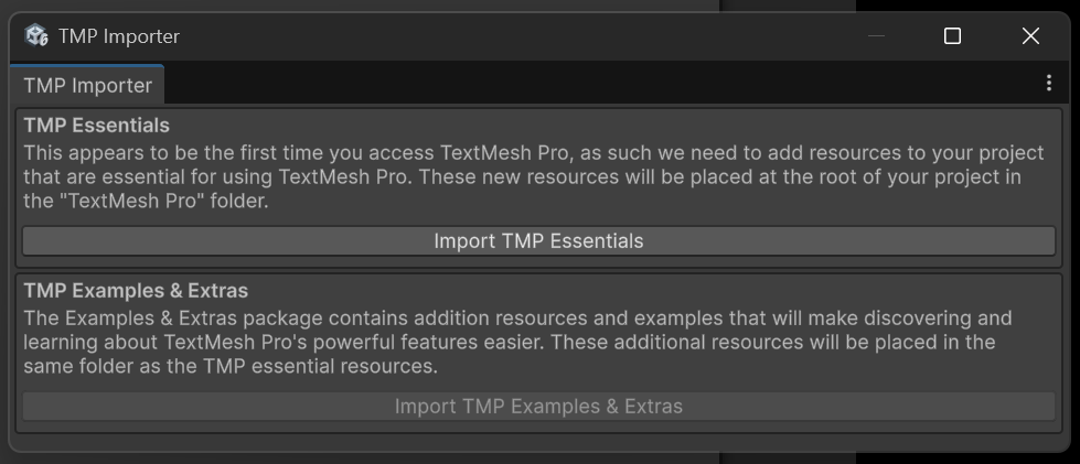
TextMesh Pro is a set of tools for controlling text within Unity. This set of tools allows us to both create UI Text and text within our game world. For text to appear within your game world, you instead should create text using 3D Object > Text > TextMesh Pro.
For this tutorial, lets begin by creating a new text element in our UI by navigating to GameObject > UI(Canvas) > Text - TextMeshPro.
As a result, we should see a text element in our game view that says New Text:
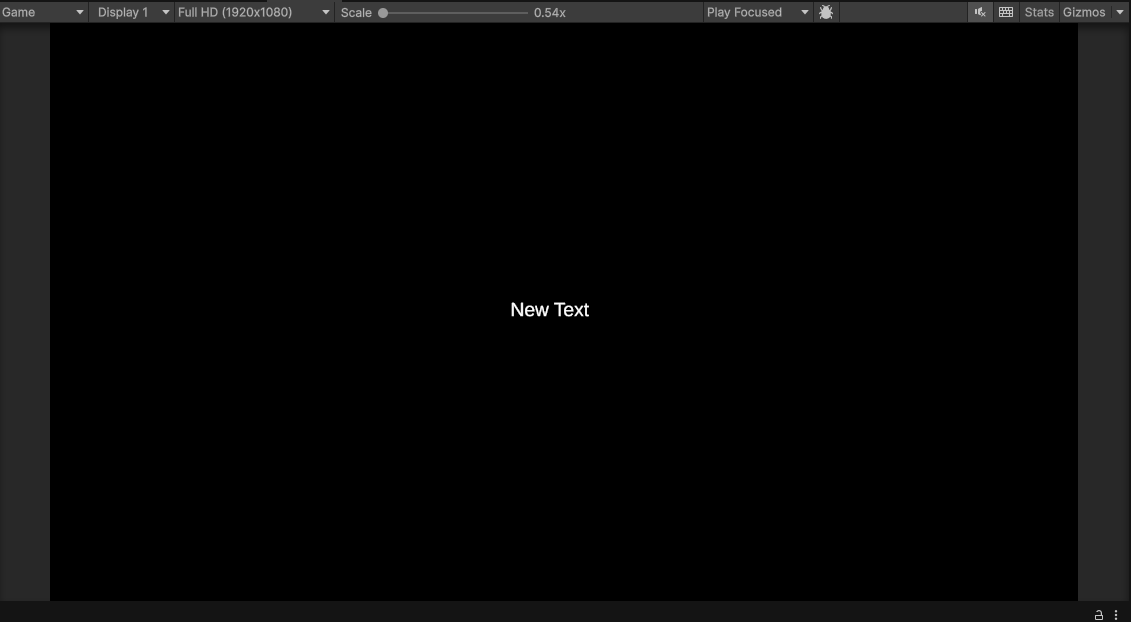
TextMeshPro - Text (UI)
The TextMeshPro - Text (UI) component (or the TextMeshProUGUI class) handles formatting text. Within this component you can edit the text string value, the font size, color, and a variety of other properties.
Lets begin by changing our font to be SCORE: 000000. We will use this as a place holder to store our score value. We can change the value of our text at the top of the TextMeshPro - Text (UI) component:
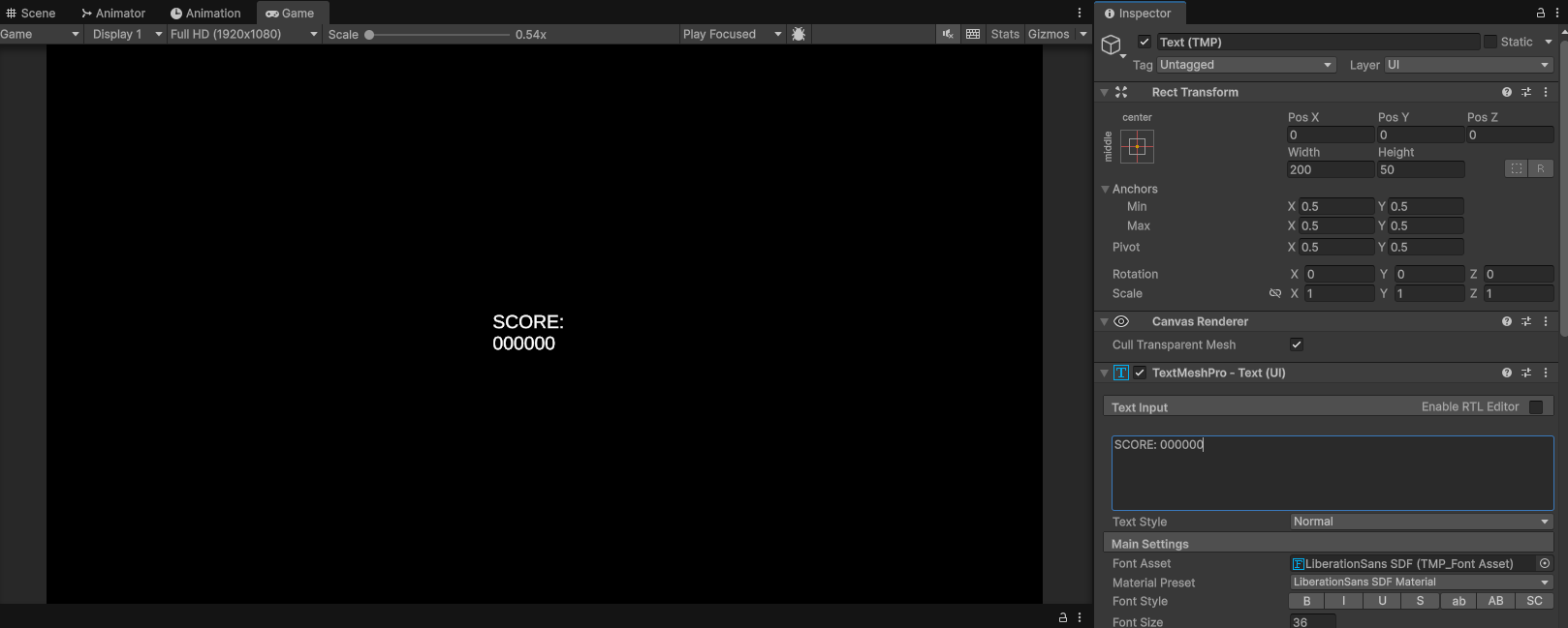
When we change our text, we notice that it wraps around. If we make the text size 75 using the Font Size parameter we notice that it wraps around even more:
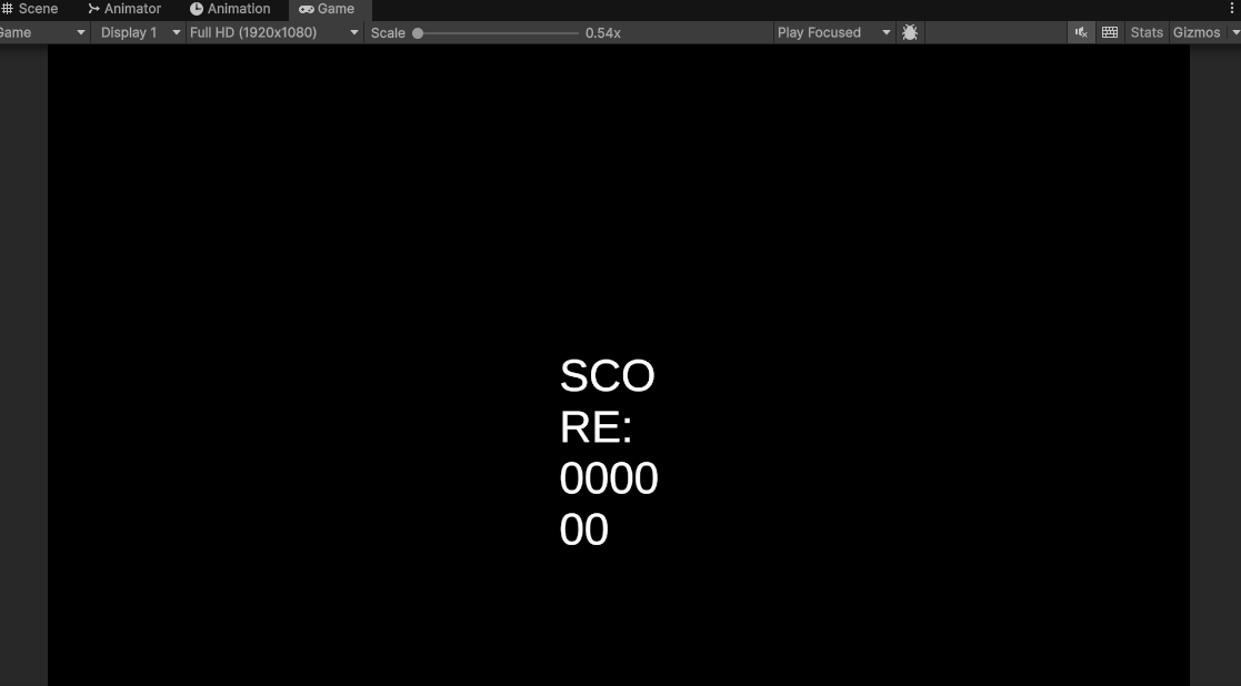
To fix this and to place our text in the proper position. We need to learn more about the Rect Transform component.
Rect Transform
Looking at our Text game object, we will notice that it does not contain a Transform like other game objects, it instead contains a Rect Transform component. The Rect Transform class inherits from the Transform class so we can still call are usual Transform public methods on a Rect Transform object. The Rect Transform component is extended to include properties and methods for handling 2D rectangular layouts that are often used within user interface design. Like design for the web using HTML and CSS, when designing a Unity interface, we can imagine all of the elements as rectangles that are placed within a specific position on the screen.
We can see this effect within our Score text. If we navigate back to our Scene view, we will notice that we do not see our Text within our camera. That is because the way Unity renders our UI within the scene view is that one unit will be one pixel within our display size. This means that if our display size is 1080 pixels tall, our canvas will be 1080 in-world units tall. As you can imagine, this makes our canvas extremely large compared to our scene.
The best way to see the full size our your canvas is either to double click on your canvas within your Hierarchy or to select your canvas and press F on your keyboard to focus on the canvas object. Both methods will focus the canvas within the center of your screen:
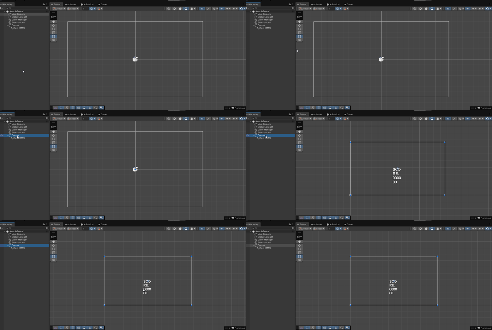
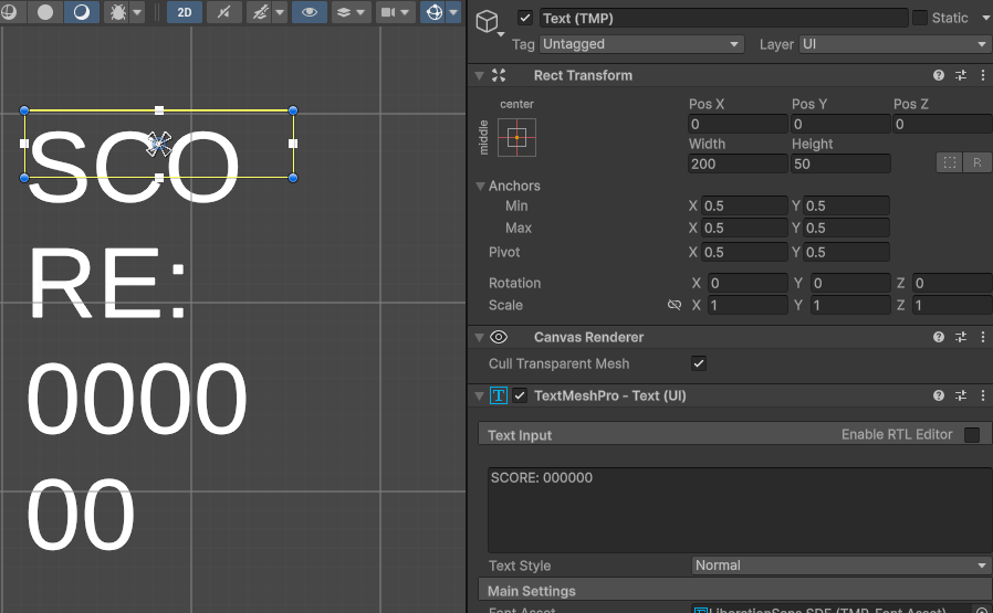
If we were then to click on our score (currently named Text), we would then see a yellow rectangle around our score representing the size of our score. In our Rect Transform, we can see our Text is 200 units wide. Since our reference size is 1920 by 1080, our Text will be 200 pixels wide at that resolution and will scale up or scale down for larger and smaller display sizes, respectively.
If we increase the width of the rectangle containing our text using the width parameter within our Rect Transform, we can begin to fit all of our text on one line:
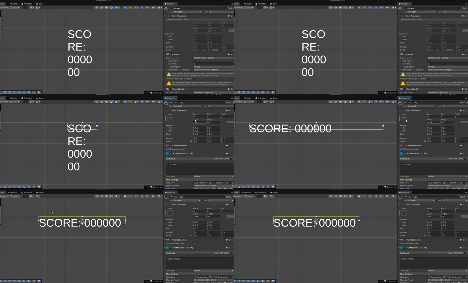
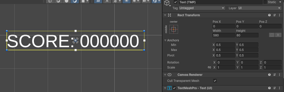
We could also change our height to allow our text to fit within the text rectangle:
Text Anchors and Positions
An important part of the Rect Transform component is the the ability to change the anchor position of a particular rectangle. By default the anchor position of a Text element is the center of our screen. This means at different UI scale sizes, our Text will scale based on this center position. The anchor is represented by four triangles making an X:
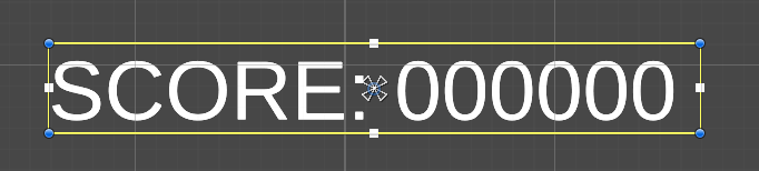
For our project we want our score text to be in the upper left corner our screen. If we were to manually place our text in the upper left corner with its anchor point in the center of screen, we would see that when we change the aspect ratio of our display from 16:9 to 16:10 (a common display ratio), our text shifts positions:
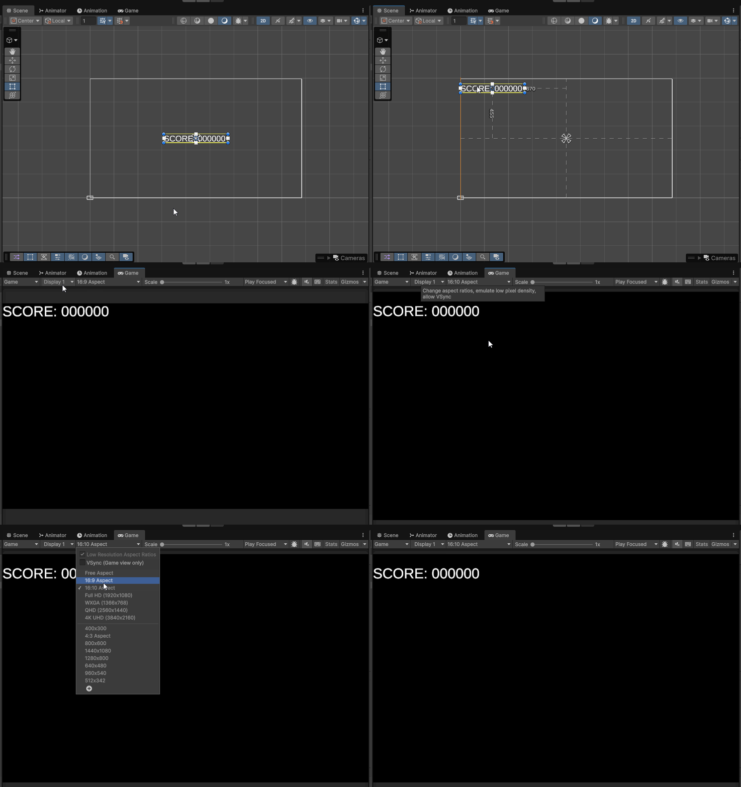
Within our RectTransform, we can choose where we want our pivot to be using the Anchor, Pivot an Position menu. Within this menu we can choose the pivot of our object by selecting one of the available options or by setting custom values within the dialog boxes. Let’s set our pivot to the upper left of our canvas by clicking on our Anchor menu and selecting the upper left corner. Notice that the anchor position of our pivot changes:
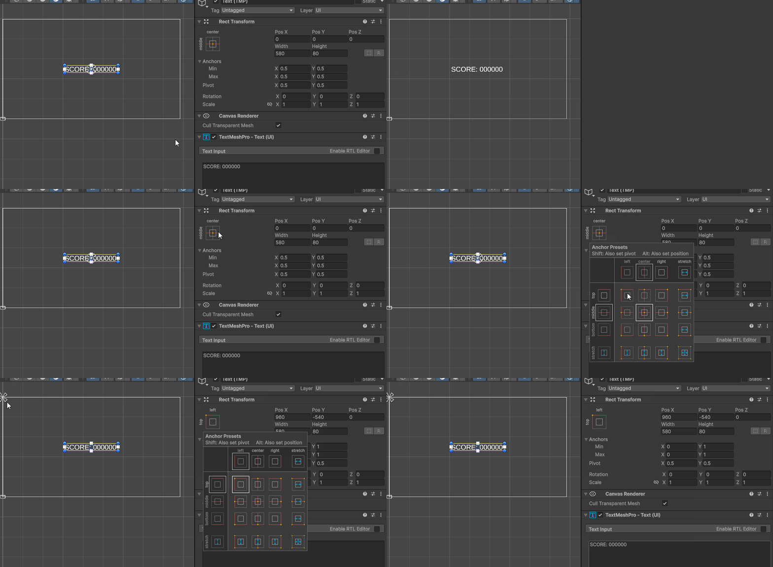
We can then move our text to the upper left corner using the the Rect Tool (T). We will notice that it does not shift positions at different resolutions:
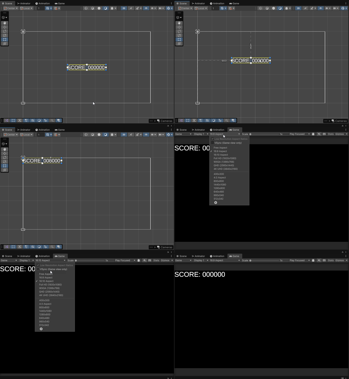
If we wanted to zero out the position of our rectangle so that its new position would be 0,0 relative to the corner, we could hold Shift + Alt when selecting the left corner within the Anchor menu. This will set the pivot of our rect transform to the corner, move our anchor to the corner, and move our object based on its pivot location to that corner:
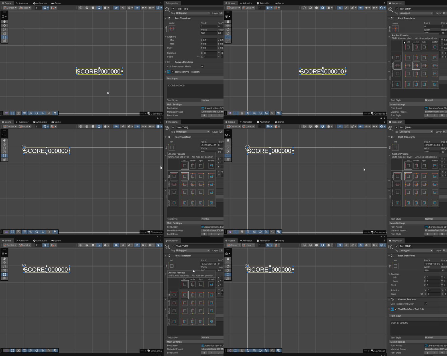
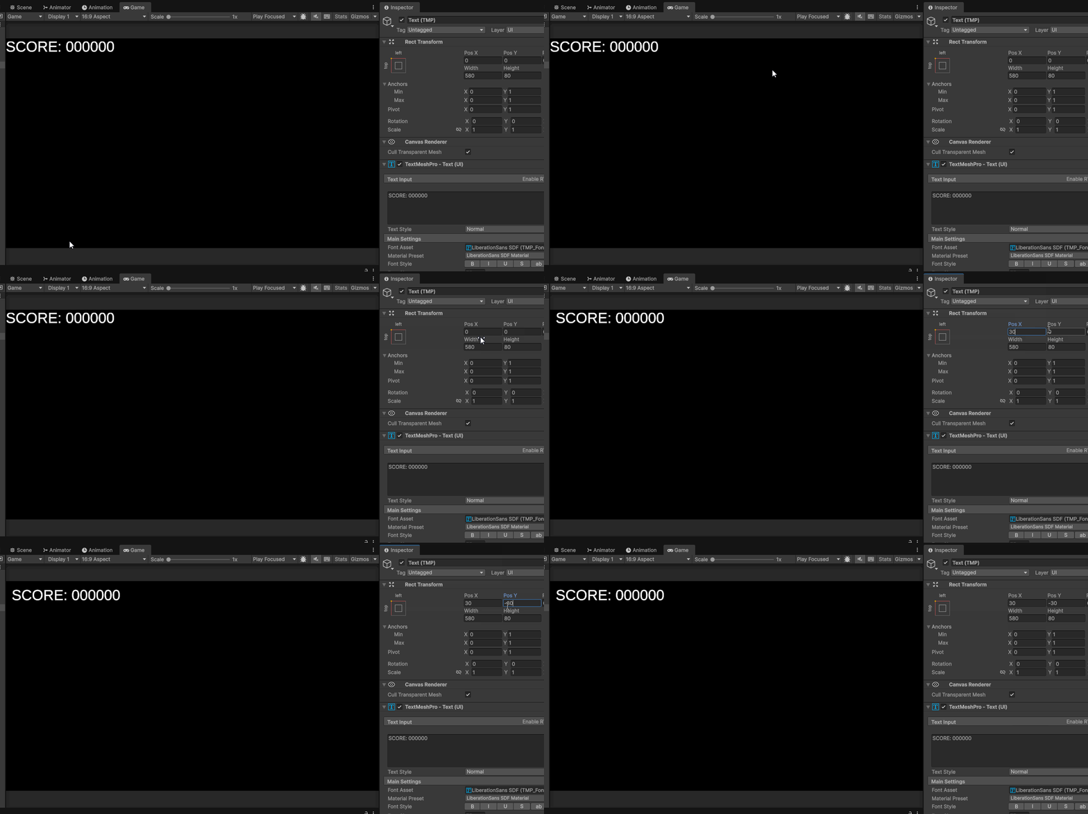
Currently our text sits right in the corner of our game window. Aesthetically, we might want to offset this text from the top and left side of our display. To do this, we could edit the PosX and PosY of our Rect Transform. PosX and PosY are the position of our Rect Transform based on the distance between the object’s anchor and object’s pivot point. We can see that if we move our pivot, anchor, and position to the upper left corner of our screen, PosX and PosY equal 0. This is because our pivot is exactly on top of our our anchor position. (Note that you might see a value such as -6e-05, this is scientific notation for a really small number -0.00006. While not zero, it is practically zero. We can also set it to 0 manually)
If we edit our PosX to 30 and PosY to -30, we can notice that our score text is offset from our corner by 30 pixels in each direction:
Creating Lives text
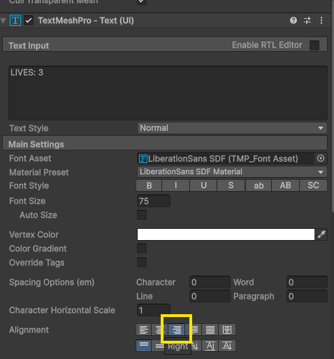
Using the same steps, we can create a lives text and places its anchor, pivot, and position in the upper right corner. The one change we want to make is to have our text be justified right within our TextMesh component. You can do this using the the justify right button:
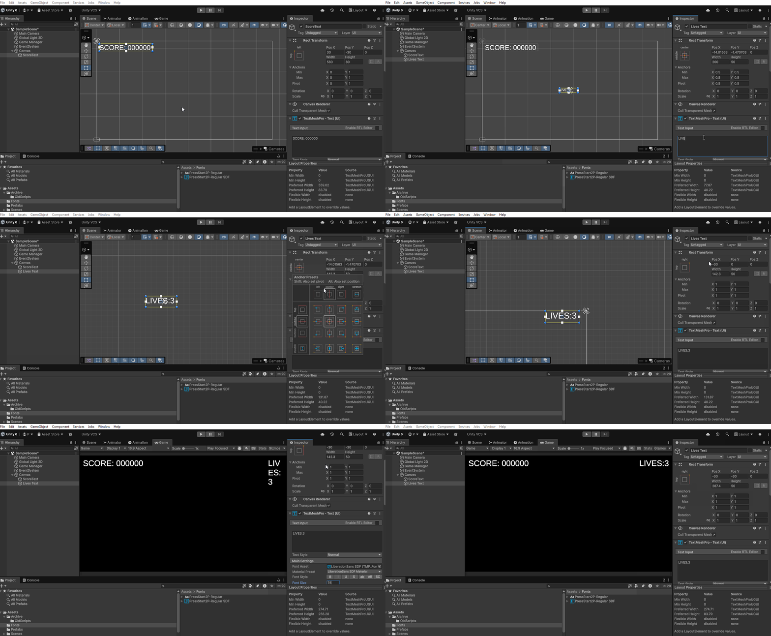
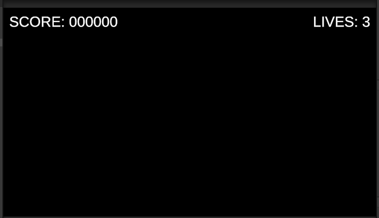
The end result of this tutorial: